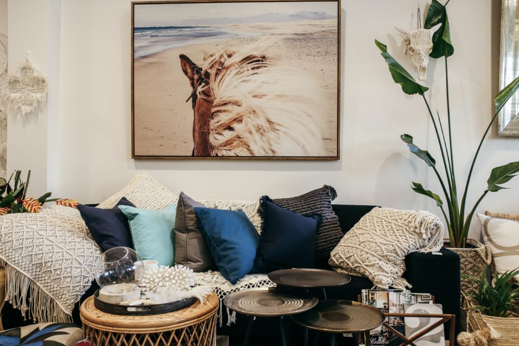
The entire color palette is conventionally divided into three tone groups. It is a warm, cold and neutral group. But there are situations in which one color evokes either a warm or a cold sensation. Only two colors do not lend themselves to such reincarnation – they are cold blue and warm orange. Blue tones are associated with chunks of ice, while orange warmth is associated with the sun. Changing color combinations leads to a complete transformation of the room.
Kitchen
It is much easier to decide on the fashionable color combination 2022 in the interior of the kitchen. Since this room is intended for cooking and eating food, the color scheme should cheer you up and improve your appetite.
In 2022, when decorating a kitchen interior, you should think about using the following colors: yellow, green, gray, beige, orange. They can be combined with light blue, red and others. It is important to create a cozy atmosphere.
Too bright and saturated colors in the kitchen can negatively affect digestion and even reduce appetite. Therefore, use color accents carefully. Although each person perceives colors differently, so be guided by your preferences.
There are many subtleties when choosing a color palette 2022. The same color can look different in different corners of the room – in one it may be brighter, in another less saturated.
Living room
The living room is intended for receiving guests and just family recreation. So you should be very careful about choosing a color scheme. Not everyone will feel comfortable in a dark or too colorful room.
Choose shades that are neutral and non-irritating. Make the background light, soft, and individual accents and details can be made bright, or vice versa. In the case of an insufficient number of accents, the desired revitalization of the interior cannot be achieved.
Bedroom
Moving on to the design of the bedroom. Since this room is a personal territory, here you can do whatever you want, taking into account only your tastes and preferences. The color gamut of 2022 can range from black to red. The main thing is personal comfort. But since the bedroom is a resting place, there are certain guidelines for choosing colors.
For a more comfortable bedtime, it is preferable to use pastel colors in the design of the bedroom. The purple tint in the bedroom is very good. A soft and calm atmosphere should envelop you with calmness and coziness. The premise of the room should be associated with cleanliness. This effect can be achieved by using white combined with cyan.
When choosing fashionable colors 2022 for your interior, in addition to the functional purpose of the room, the area of the room should be taken into account. A large, spacious room can be filled with light and comfort with the help of warm colors. They evoke positive emotions, create a positive attitude.
You can visually enlarge a small room by applying cold light colors. Remember this simple truth: a dark color decreases space, and a light color increases it.
Children’s room
Initially, you should determine the functional purpose of the living space, only then proceed to the selection of shades. For example, psychologists have proven that it is preferable to decorate a children’s room in calm, soft colors.
Yellow color affects concentration of attention, increases the child’s creativity. Red shades in the interior will awaken the energy and mobility of the baby, but an overabundance of emotions will prevent him from sleeping peacefully.
Color Fashion Trends 2022
You can create an atmosphere of comfort and coziness by using trendy 2022 colors and various combinations of contrasting shades. The background can be done in calm or bright colors. And then add colors of a different tonality to this background. For example, a pale yellow, warm orange, beige color will harmonize well with red.
Decorative elements can have a wide variety of colors. It is important not to overdo it and not turn your room into “fireworks”. Don’t use all the colors of the rainbow at the same time.


